RL Core Website Case Study

▶ Building A Digital Footprint for RLCore
Building the Process that Guides a Brand to Stand Apart from the Noise
Functionality is not just a word; it is a system. When RLCore tasked us with developing a scalable brand identity system, our guiding principle was to bring functionality into design.
▶ Creative Direction: The Building Blocks of Style, Story, and Significance
Objective
The Project Background
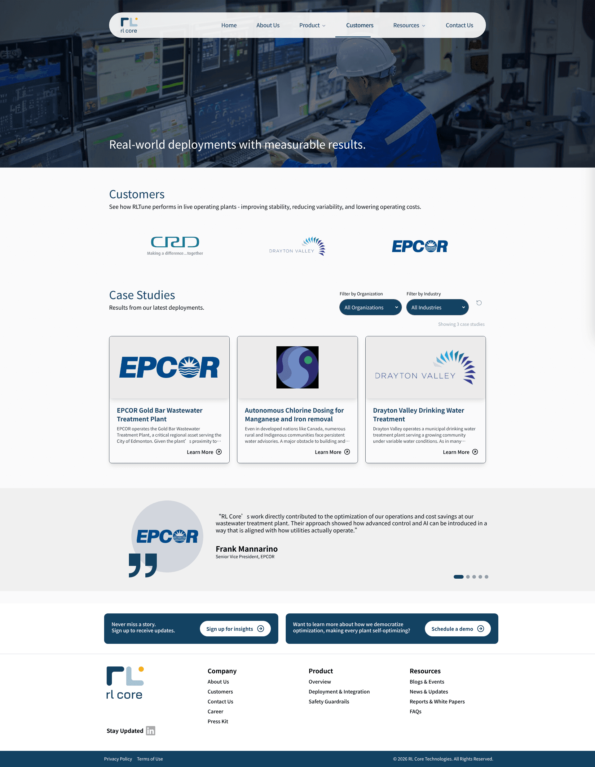
RLCore is a Canada-based deep-tech start-up. RLCore devises solutions for industry process control powered by reinforcement learning. They entrusted us with building a scalable visual style guide that will be reflected across all the strategic digital touchpoints. Our work also included content framing and developing an authority-driven website for RLCore.
The Goal
Our goal was to design a scalable visual identity system that allows RLCore to establish trust. We aimed to balance deep-tech expertise with functionality. For the website, our core objective was to establish a new category for the product. We sought to empower the ideal customer profiles to make decisions by addressing common pain points.
The Challenge
Our primary challenge was to develop a guiding narrative that would be reflected in all our design choices. The narrative was required to become the looking glass for RLCore and what they meant to become.


▶ Creating a Strategic Brand Foundation Built for Long-Term Growth
Creative Direction: The Building Blocks of Style, Story, and Significance
The Insight
RLCore positioned its product RLTune as the “intelligence layer for industrial control". We used this positioning statement as the driving force for building our narrative and all our design choices. The insight was simple: the visual identity and the website should seem familiar to the ideal customers yet stand out with their technical authority and innovative approach.
The Idea
Our core idea was to address the ICP pain points in a language that they speak. We took inspiration from the minimalistic, modern, and tech-inspired motifs to design the visual identity for RLCore. Our vision included a complete style guide that is innovative yet pragmatic.
▶ Impact Delivered
The Execution
The Brand Style Guide
Our brand style guide was an exact reflection of RLCore’s brand persona. It was designed to portray RLCore’s innovation, sensibility, trustworthiness, and intelligence. The choices of colours were deeply influenced by a modern tech-inspired aesthetic. On the other hand, the patterns and motifs were inspired by the brand’s core messaging: rapid adaptation and an easy, uninterrupted flow of information.
The Narrative Building
Once the core idea was decided, our next step was to frame a narrative that could be scaled across the website. We decided to start with the “whys". We framed the content for the RLCore website, answering the guiding question, “Why should the ICPs choose RLTune over others?” We offered a bird’s-eye view of RLCore’s impact and expertise through the website. This allowed us to create the right amount of intrigue, leading to inquiry generation.